Designer’s Desk: Know Bad Design When You See It
Gawking at ugly houses is a favorite pastime of mine. Pointing out design flaws in homes around me can be exasperating for my friends and family. “Why don’t you point out something you like for once?” I’m often asked. Because that’s not as much fun! With good design there is very little to critique. I can simply admire, at ease with the feeling of contentment when all elements are working together in perfect harmony.
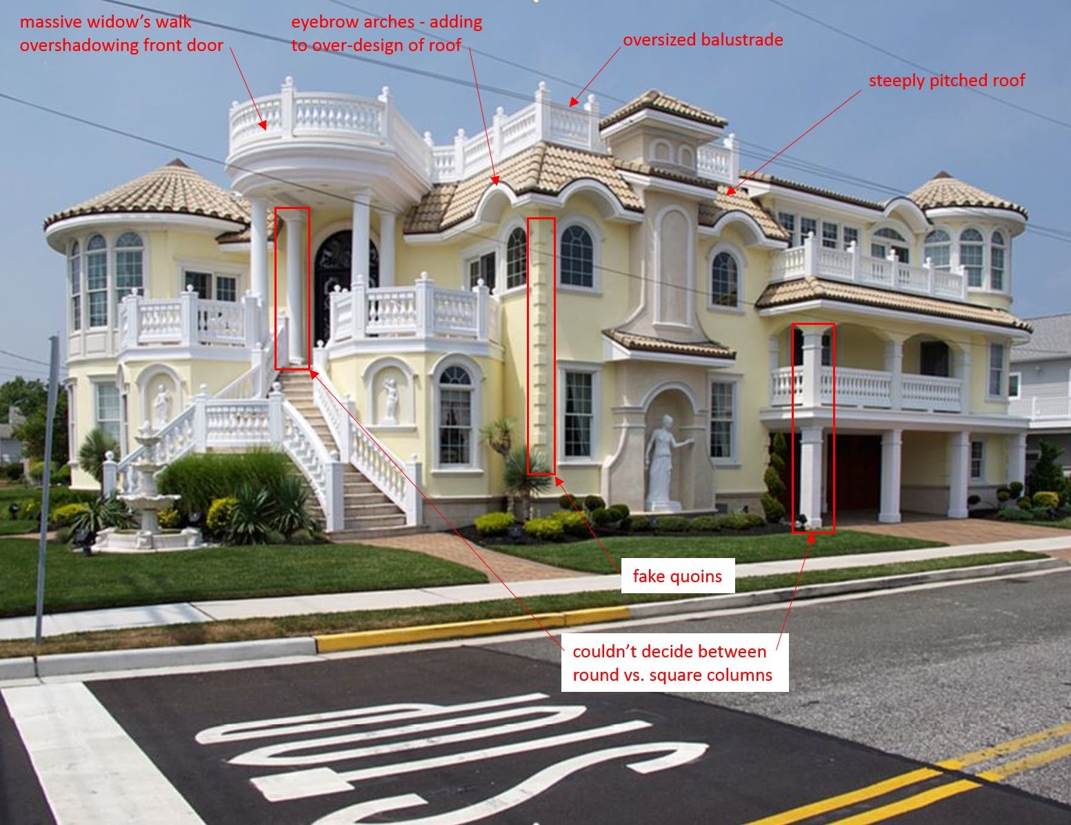
The concept of beauty is subjective. However, there are some homes that are objectively ugly. An ugly home is one that is not thoughtfully designed, with no regard for basic design principles or historic architectural styles. Take this home for example…
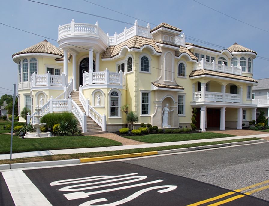
Mixing and matching is a hallmark of Mediterranean Revival, or any classical revival style, but straight from the top, they’ve broken some key rules of the style. One of the most distinctive characteristics of Mediterranean style architecture is its low-pitched, red tiled roofs with wide eaves. This roof, with its steep pitch, competing shapes and oversized balustrade just looks off. Adding to top-heaviness is the massive widow’s walk, jutting over the front entrance completely overshadowing the front door. Mediterranean design values balance, symmetry and unity, and this home has none of these qualities. From the over-designed roof to the fake quoins and Venetian statues, it reads more chaotic than eclectic.
Most people would agree that this not an architectural masterpiece, but what about the homes that are less obvious in their gaudiness? The ones that to the untrained eye might seem…not so bad, even kind of pretty.
Here are a few rules of thumb to help you distinguish good design from bad.
Stylistic Integrity
Is the home accurately portraying a particular architectural style? Each style of architecture has its own set of characteristics. This doesn’t mean you can’t mix styles, that’s called eclecticism (we’ll save that for a more advanced lesson) but when mixing elements from different styles with no rhyme or reason, things start to go awry. For example…
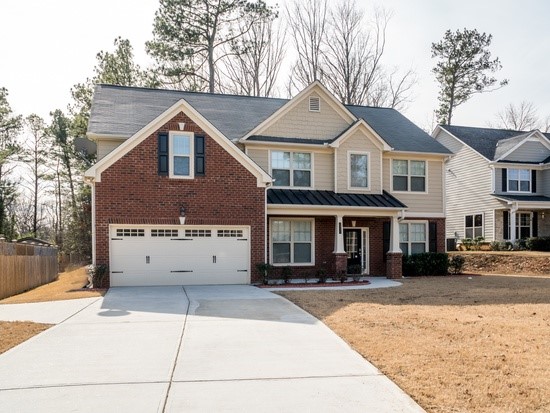
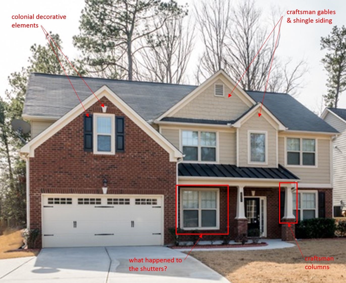
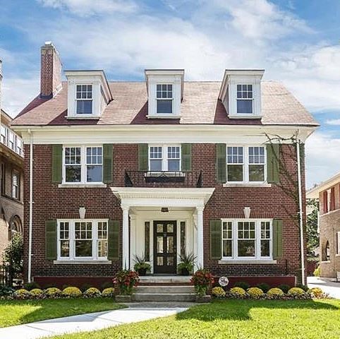
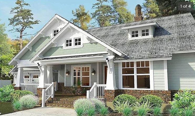
See the difference? If you look up the architectural characteristics of colonial and craftsman styles, the homes pictured above are consistent with these two architectural styles, respectively. Consistency is key to a clear design vision. Without it, you end up with a jumbled-up mess that lacks any style whatsoever.
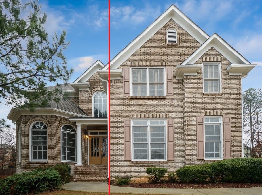
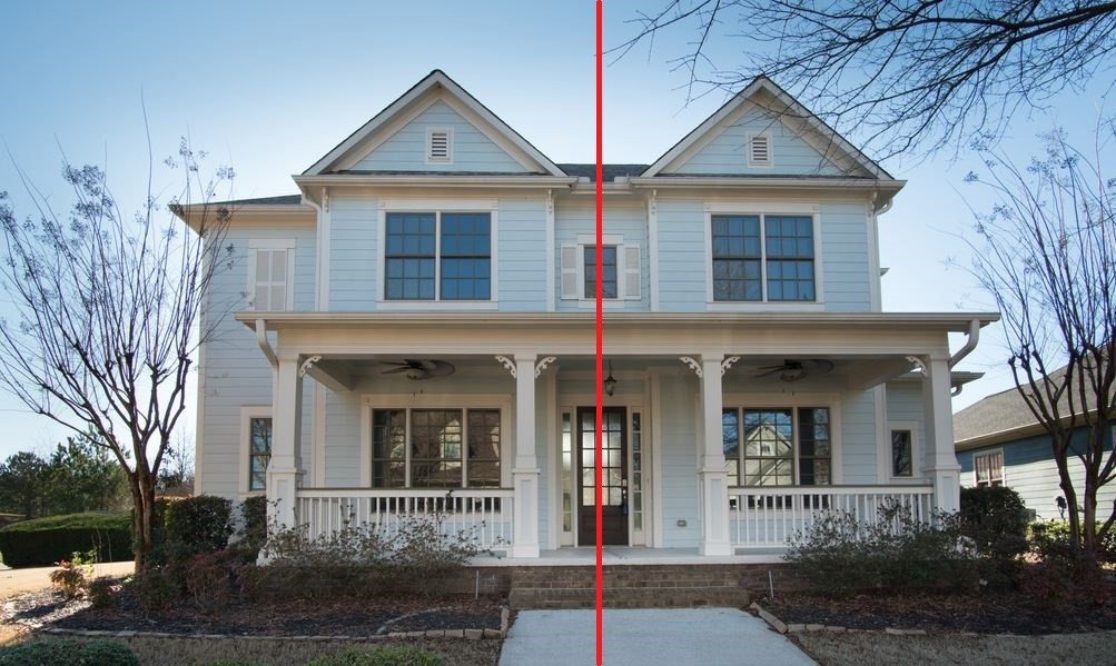
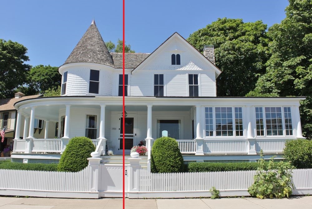
Balance
If you draw an imaginary line down the center of the home, do the two sides have equal visual weight? Balance refers to the distribution of the visual weight of the massing, colors, texture and space. These elements should be balanced to make a design feel stable. A home can have symmetrical or asymmetrical balance.
Proportion
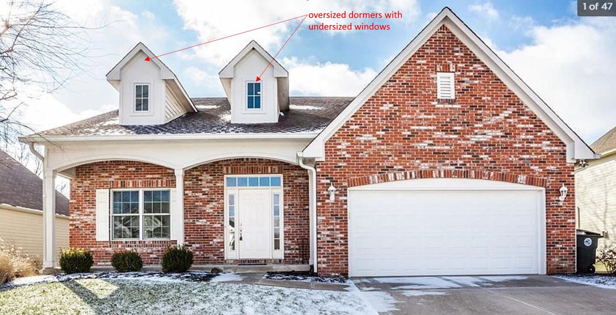
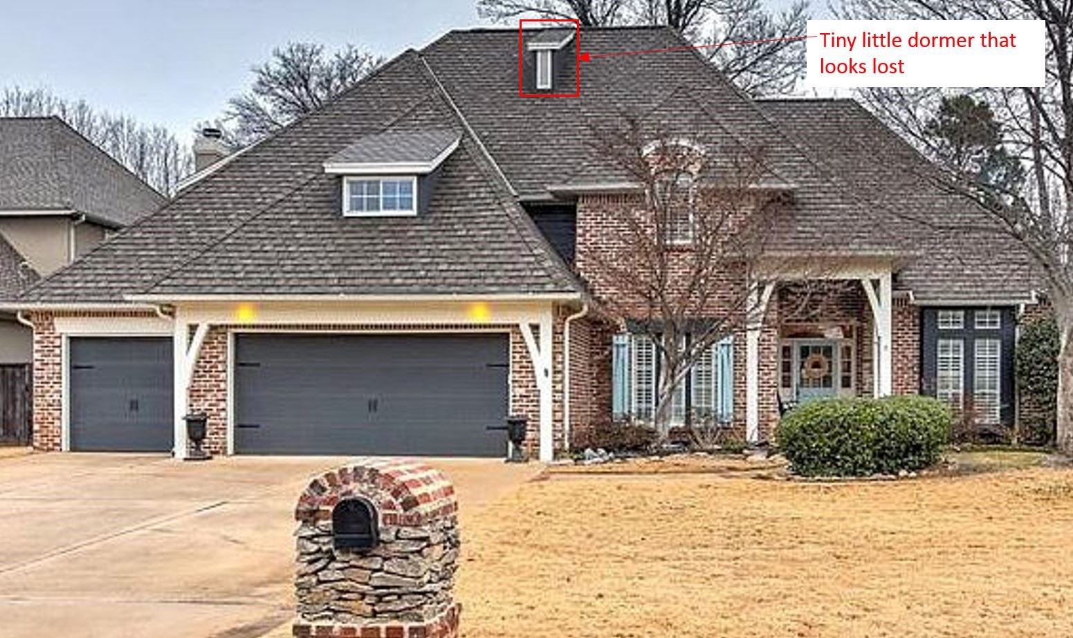
Do the visual scales of the various elements of the home relate well to one another? Proportion creates a feeling of unity and architectural harmony. Incorrect ratios result in a home that’s visually chaotic or off-balance.
Dormers are one of the most common places we see incorrect proportions.
Stylistic integrity, balance, and proportion are just a few factors that must be considered when designing a home or any building. We’ve barely scratched the surface when it comes to architectural concepts, but don’t worry, there’s more to come! This will be the first in a series of educational blog posts about residential design, seeking to inform non-designers about design principles and how they can be used to make your home more beautiful.
If you liked this article and want to dive deeper into this subject, check out the very informative and wildly entertaining blog McMansion Hell. The author does a great job at explaining architectural concepts, specifically focusing on residential design in the American Suburbs.
Photos taken from screenshots from Zillow.com unless noted otherwise. The use of this content is for the purposes of education consistent with 17 USC §107.
OTHER POSTS
