Designer’s Desk: Kitchen Trends for Today and Tomorrow
Kitchens are the most popular rooms to remodel and can be the most expensive. Considering the level of investment that goes into remodeling a kitchen, every little detail can feel like a monumental decision. Everyone wants their new space to be on trend, but nobody wants it to appear dated 5 or 10 years down the road. Here are a few kitchen trends that are not going anywhere any time soon.
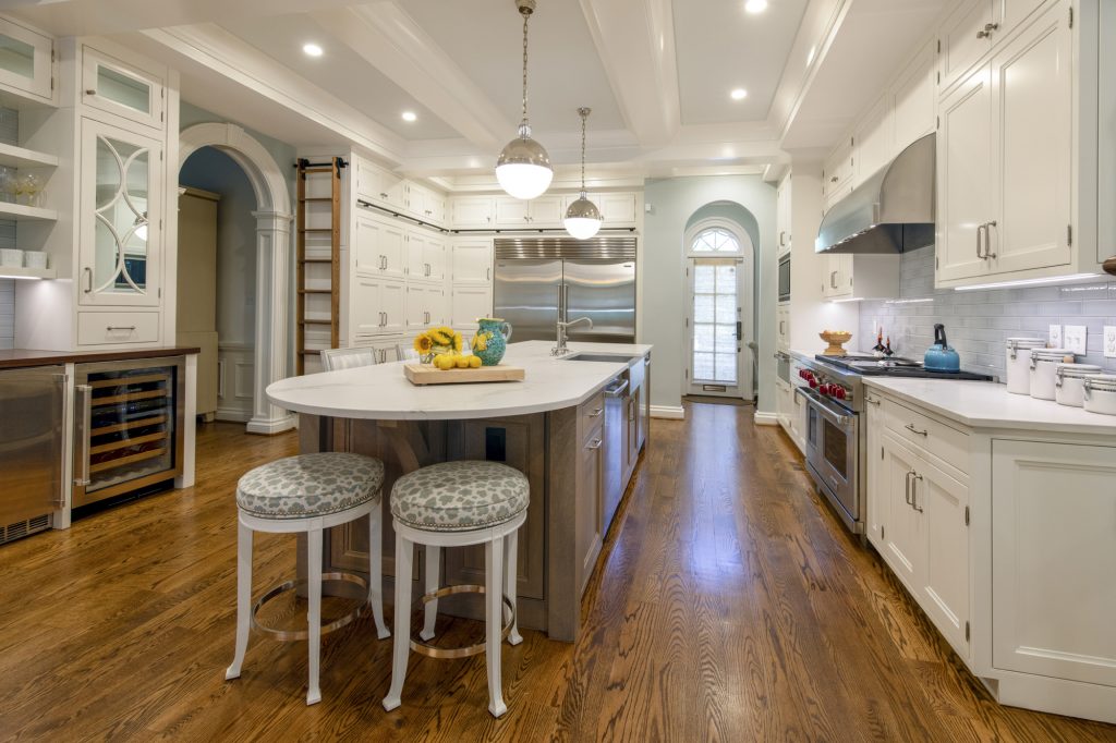
Hardwood Floors
Especially in homes that already have hardwood throughout, we are often ripping out cold, hard tile flooring in the kitchen and replacing it with hardwood to blend with the rest of the house. Sticking with one consistent flooring materials makes the space feel more expansive, and hardwood is much warmer and softer underfoot than tile. Sticking with one continuous flooring material throughout the home makes the newly remodeled space feel like part of the original design.
Moody Hues
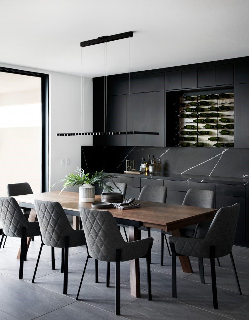
Deep colors add a touch of dramatic sophistication to any space. Charcoal, navy and deep green tones are emerging onto the scene in combination with, or in lieu of the light grays and whites that have dominated kitchen design over the past several years. It is a common misconception that dark colors inherently make a space feel smaller. When used wisely, dark colors can actually create the perception of greater depth.
Matte Finishes
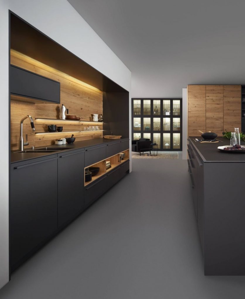
In almost every category – cabinets, countertops, plumbing fixtures, flooring – matte finishes have been increasing in popularity over glossy lacquers. These velvety, supple finishes somehow manage to feel both unpretentious and luxurious. Low-luster finishes have the added benefit of hiding imperfections and scratches. Matte finishes are soft on the eyes and to the touch.
Wood Accents
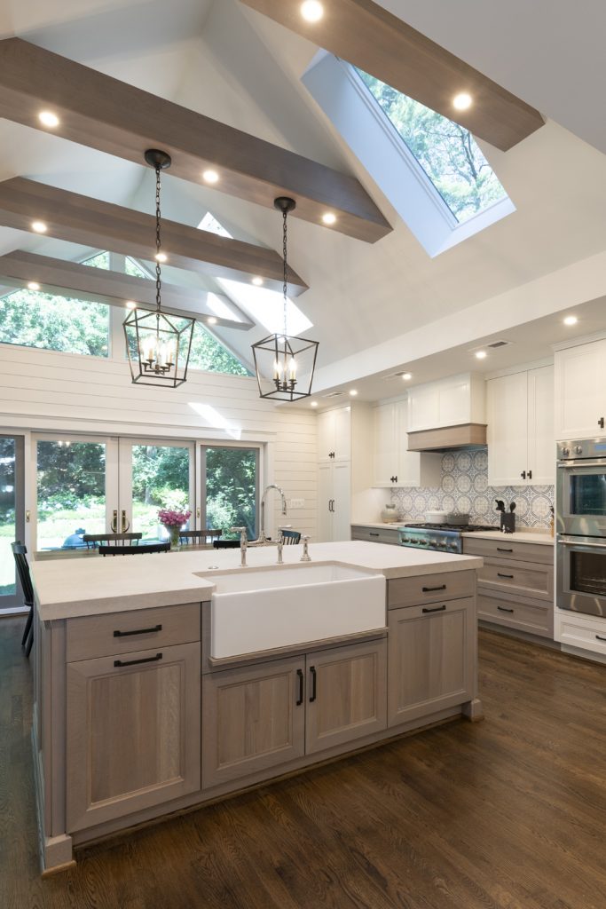
While painted cabinets are still the preference, we are getting lots of requests for rustic wood accents sprinkled throughout. In general, there has been movement recently towards more tactile, humble materials, and that trend is expected to increase as we enter the 2020s. Touches of wood add texture, warmth, and visual interest to an otherwise plain space. In the photo below, wood accents on the base cabinets, hood, and beams add visual interest and carry the viewer’s eye through the space.
Quartz Countertops with Large Veining
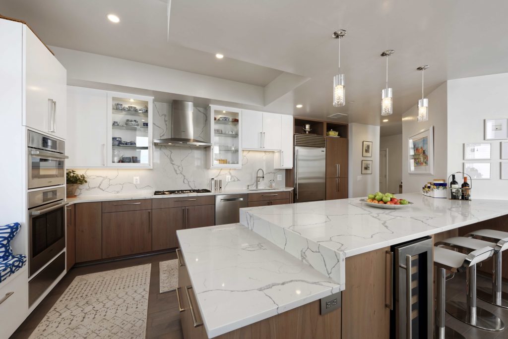
Man-made quartz continues to be the material of choice for countertops due to its ability to mimic the luxurious look and feel of natural stone, without the maintenance. The busy, speckled granite countertops that were so popular in the early 2000s are a thing of the past. If you want a countertop with some character, look for patterns that have large swaths of one main background shade with contrasting, widely spread veining. The dramatic veining on the countertop and backsplash below adds character and ties in nicely with the stainless steel appliances.
Vintage Industrial Fixtures & Hardware
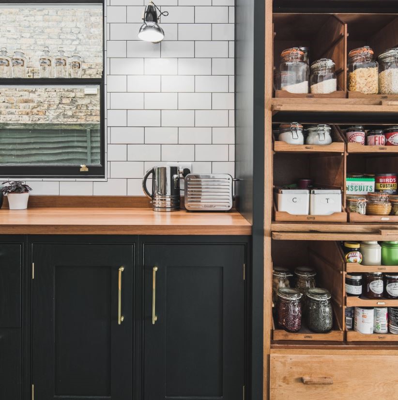
Part minimalist, part nostalgic – the fusion of classic styles with clean lines makes vintage industrial a versatile trend for new and old homes alike. The cabinet hardware, light fixture, and countertop accessories add a vintage industrial flair to this kitchen.
Elevated Backsplashes
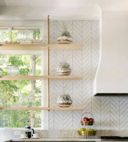
For a time, it was popular to break up the backsplash by adding a horizontal band in a different shape, size, or color tile. This looks dated and makes the space feel squat. Instead, find opportunities to create the perception of height by orienting the tile vertically. You can even carry it all the way to the ceiling. Around the hood or a window, for example, instead of wall cabinets on either side, opt for open shelves and create a feature that draws the eye up. The chevron backsplash and floating shelves in the photo below add a trendy touch to an otherwise traditional kitchen.
Pro Tip: Stick with the same shape, color, and pattern throughout so it doesn’t get too busy.
Large Windows
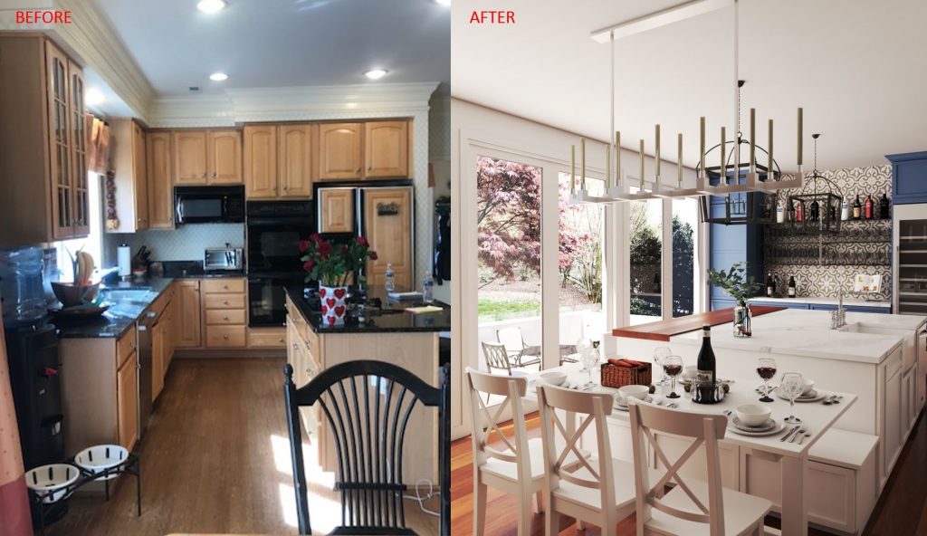
Natural light never goes out of style. Kitchens of the past were enclosed spaces, often with just one small window over the sink. Now that the kitchen is being celebrated as a gathering place for family and guests, homeowners want to make it as comfortable and inviting a space as possible. Many of our clients are forgoing floor-to-ceiling cabinetry in favor of large windows wherever possible and instead, grouping tall runs of cabinetry and major appliances along interior walls where they won’t block natural light. Floor to ceiling windows in the design below (pictured on the right) will bathe the new kitchen in natural light and enhance the view of the beautiful back yard.
Connect with Stephanie on LinkedIn or Houzz.
Photos taken from screenshots from Houzz.com unless noted otherwise. The use of this content is for the purposes of education consistent with 17 USC §107.
This article first appeared on BOWA’s website at: bowa.com/kitchen-trends-designers-desk-stephanie-dickens
OTHER POSTS

